


Future Vision
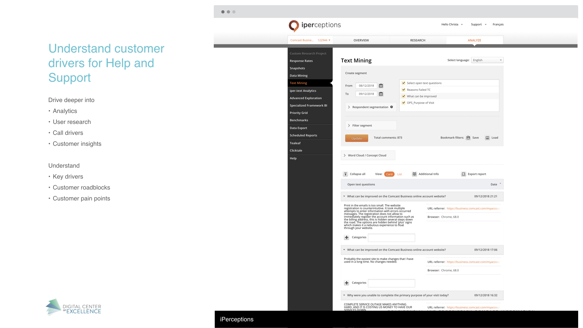
I started understanding our customer’s needs for support by diving deep into our analytics, performing user research, and looking at our metrics for call drivers. My goal was to learn what pain points our customers were facing with our products and services, as well as, what was roadblocks they experienced with our current Support experience.
I then performed competitive analysis to understand the support landscape and identify key features that might shape the future support experience.


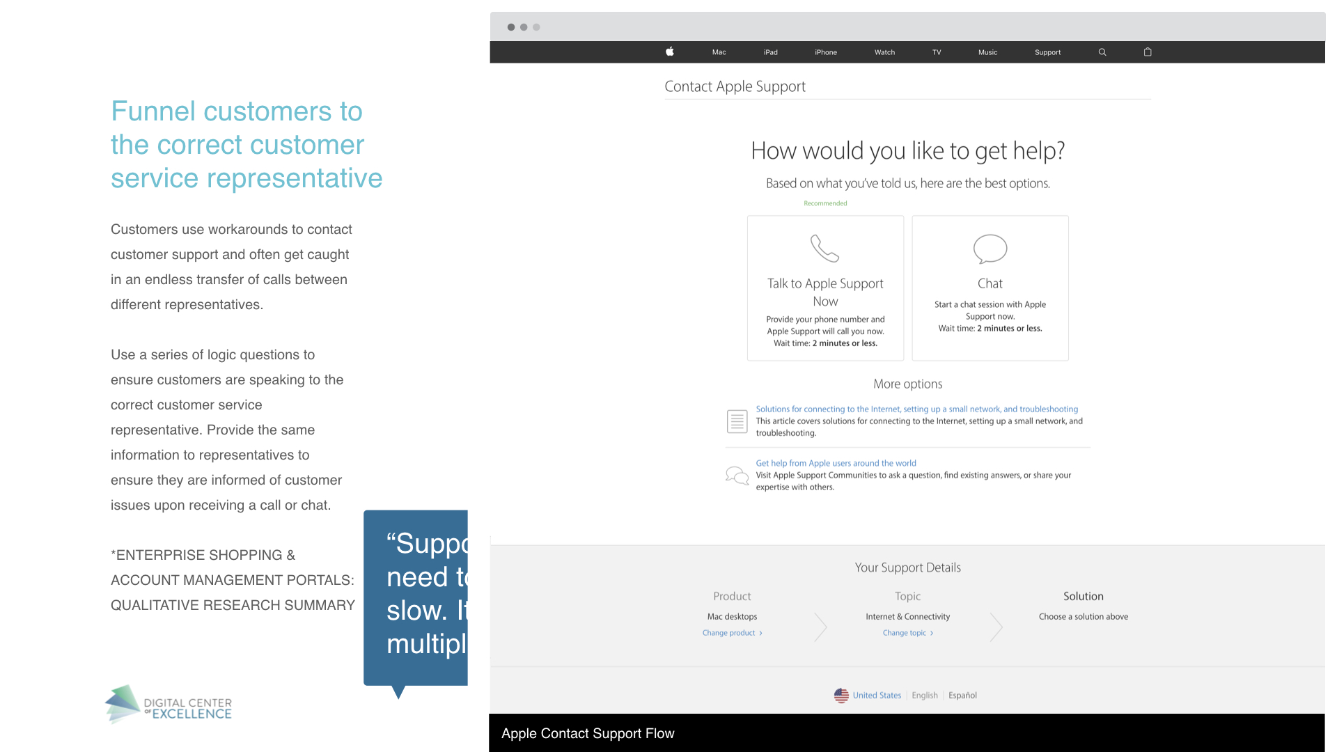


“The internet troubleshooter doesn’t work. It cannot remotely reboot our router, and when it fails, it says ‘would you like to chat with someone?’ and if I say ‘yes’ it says, ‘no one is available.’ I keep trying back, and it has said this for weeks, so it clearly is non-functional.”
Stakeholder Alignment

To find where the needs of customers intersected with the goals of the business, I conducted a stakeholder alignment workshop. Some key business needs were:
Lower Support Costs - Drive down cost by reducing call volume and allowing customers to self-service.
Leverage Data Internally - Leverage existing data to evolve content and create an intuitive experience.
Visibility into the Customer Journey - Full understanding of the customer journey beginning with sales throughout the customer life-cycle to align customer and business needs.
Future Proofing the Front-end and Back-end - Creating a flexible system that can grow and change with our company.
Primary Research
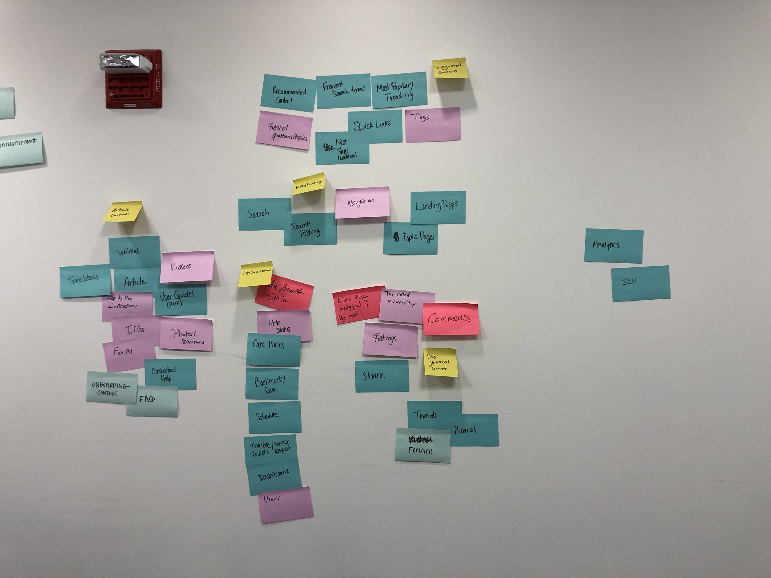
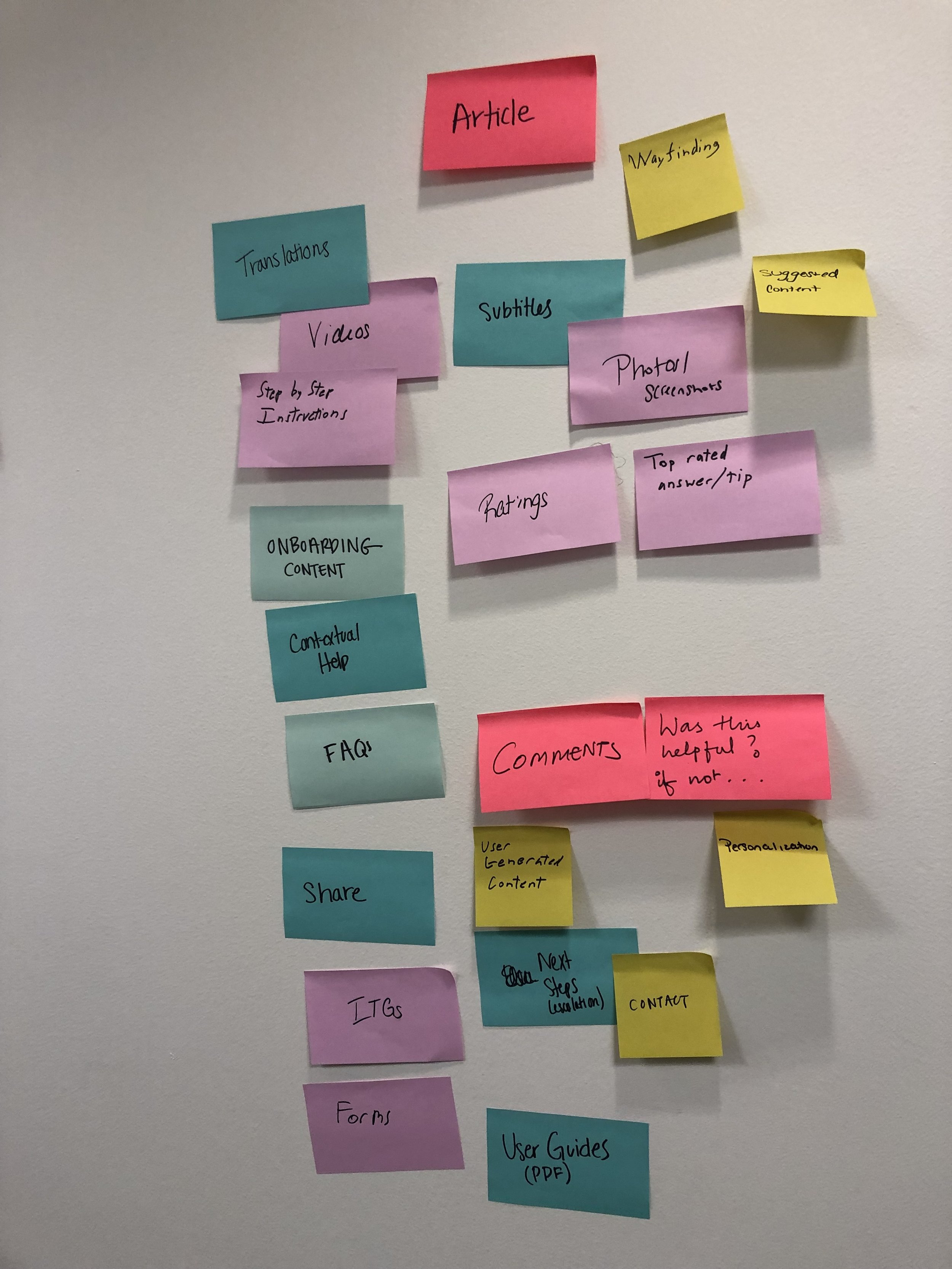
Card Sort
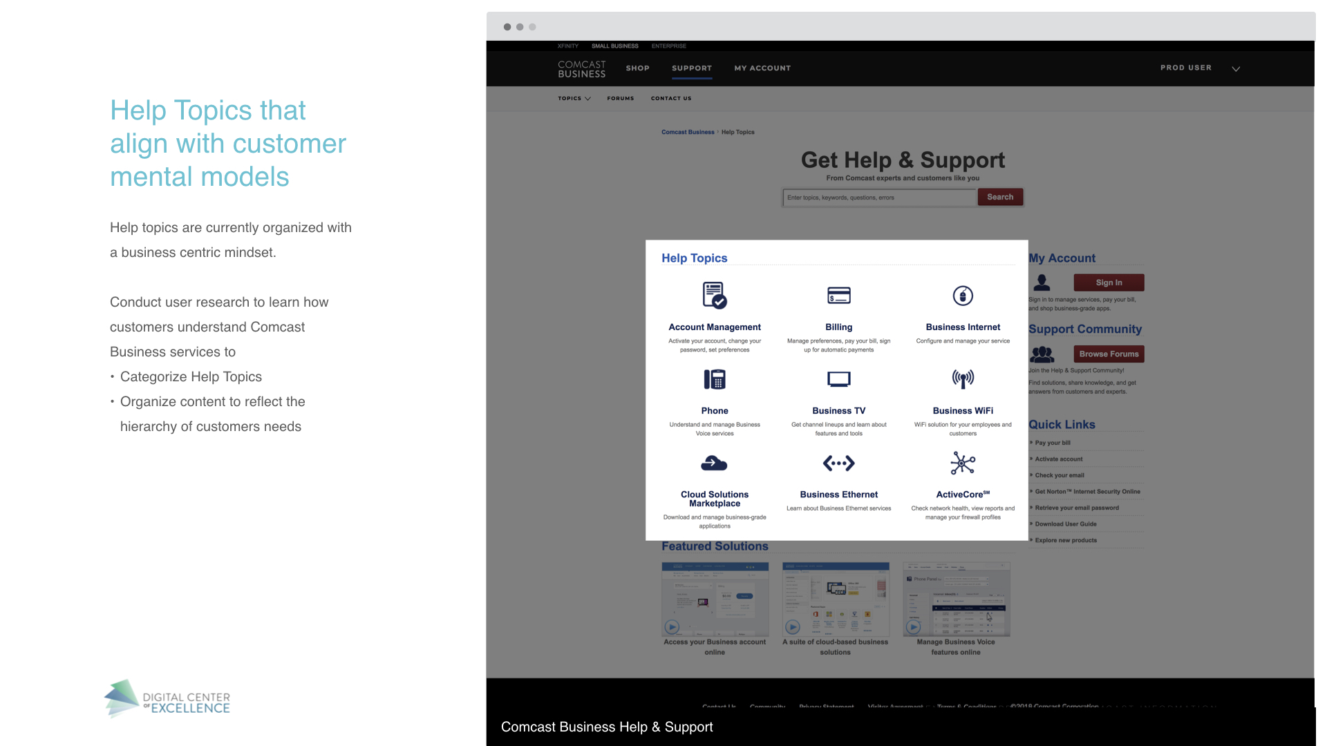
As navigation was a critical part of the support experience, my team conducted a card sort to see how participants would label and categorize support-related topics. Participants often organized support topics into groups based on how relevant they were to their own businesses and tended to ignore topics that they were unfamiliar with. Categories also trended towards broad, encompassing labels based on the type of service rather than on individual products. These included:
Internet
Phone or Voice
TV
My Account (sometimes included billing, sometimes separate)
Service and/or alerts (for installation, maintenance, notifications, error code lookups, etc.)
User Interviews
We interviewed a sample of our users to better understand who they are, what their expectations are, what’s important to them, what frustrates them, and how they think. Some of the insights included:
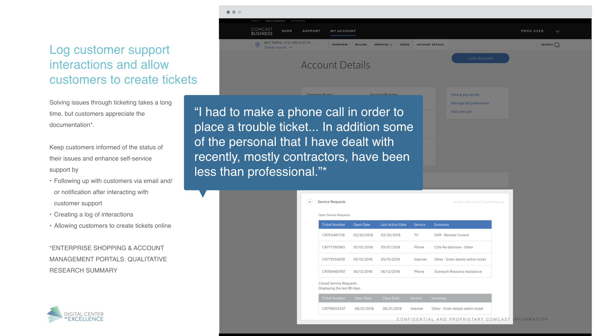
Users often don’t know the difference between Comcast Business’s products, particularly for products they do not have.
Users are eager to use a chat support feature, but only if it is convenient and trustworthy. They want to be sure the person on the other end is not a bot, isn’t reading from a script, and is knowledgeable. They feel using chat frees them up to work on things while they wait and gives them a valuable record of the conversation.
Many users never enter their My Account section and were unaware that it contains important features such as chat support, despite interest in these features.
Users generally prefer to learn by reading articles, especially the more technically minded users. However, videos are beneficial for highly visual content and overviews.
Users want to be able to personalize how they get notifications about support appointments.
Benchmark Usability Test
We evaluated the current support pages with a test to flag current usability issues. Users were asked to try several common tasks using the support pages to evaluate the ease or difficulty of use. Some findings included:
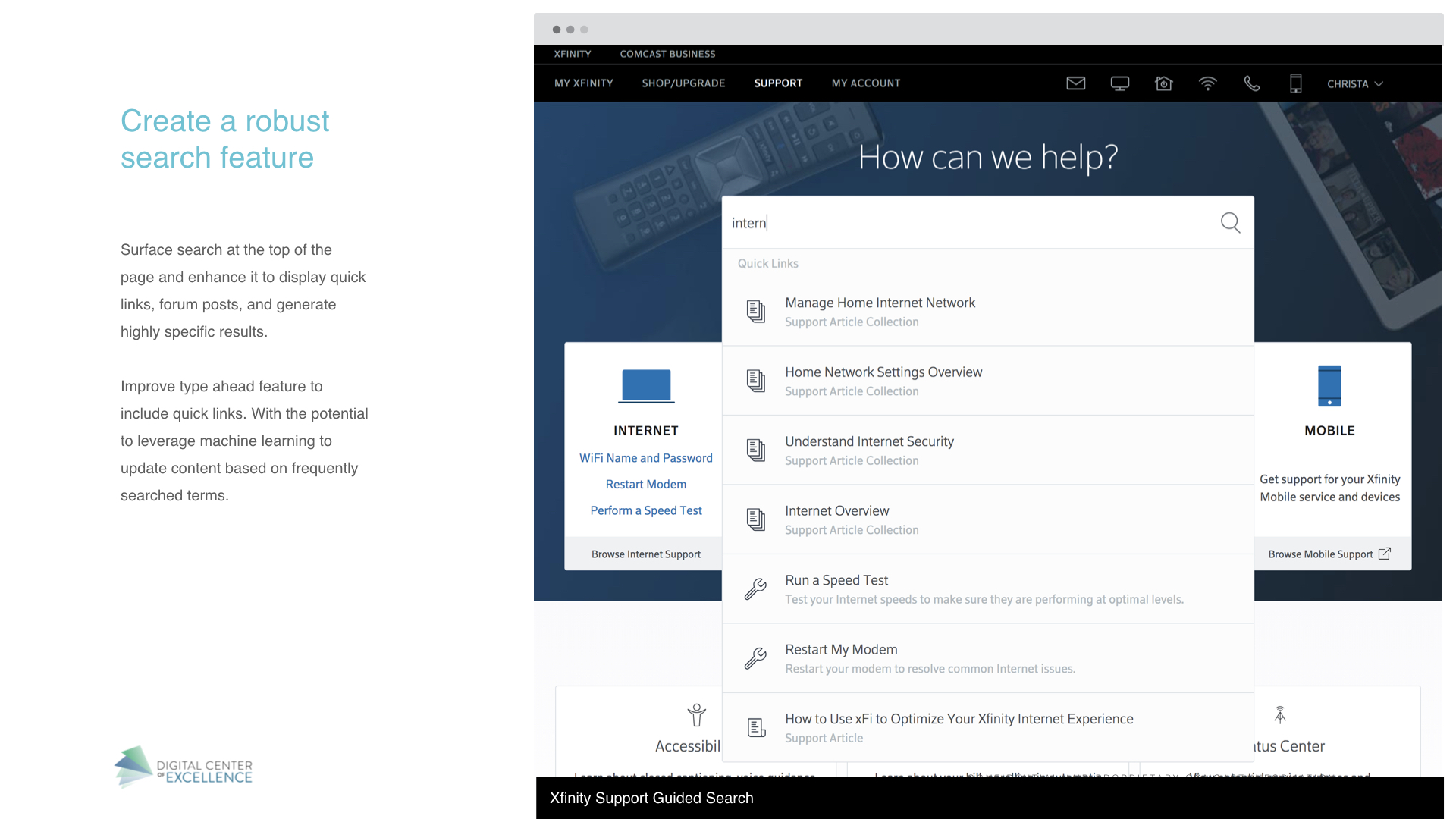
The search feature does not often give results that are useful to users and the results are difficult to read.
Users expected to have quick and easy access to support contact information, which is not currently available on the support pages.
Users expected to find outage information in a prominent location on the main support page.
Users were often confused by product terminology and weren’t sure which categories to select (i.e. Business Internet vs WiFi or Business Voice vs VoiceEdge).
Users who used My Account expected personalized in-context support when they logged in.
Information Architecture
Based on the initial research and a study of the current-state article content, I created a new information architecture for all support articles and was validated using tree testing.

Tree testing results
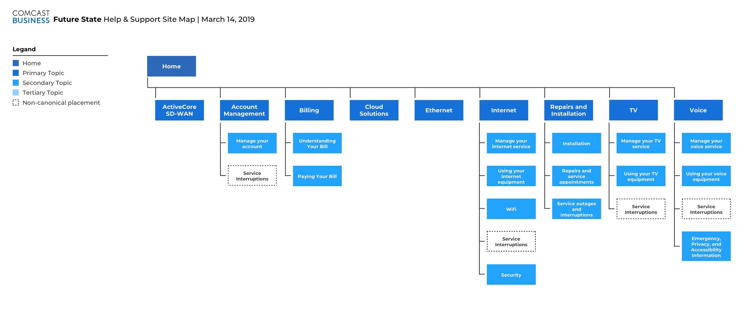
Future state information architecture
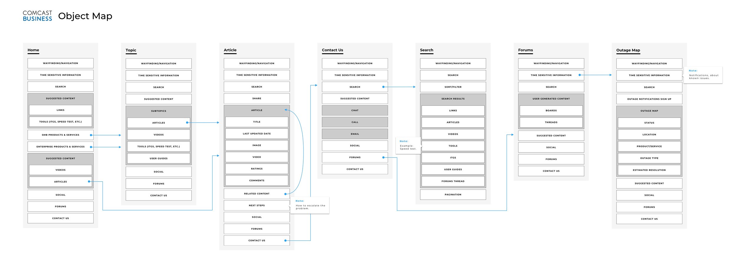
Object Oriented Design
Using an objected oriented UX approach I worked to created a fluid and modular ecosystem for the content needed within the site. This approach helped to understand what objects needed to live within the site, align stakeholders before screens were designed, and create a seamless handover to development.
Wireframes and User Testing
Based on the object maps, research, and information architecture, I created wireframes and we put through two rounds of usability testing. Some findings included:
A lot of participants latched on to the quick links right away once they had selected a knowledge base page. They were by far the go-to options that people would click on, often bypassing the articles completely.
Participants by and large had a difficult time finding service outage information because it was buried in the article lists at the bottom.
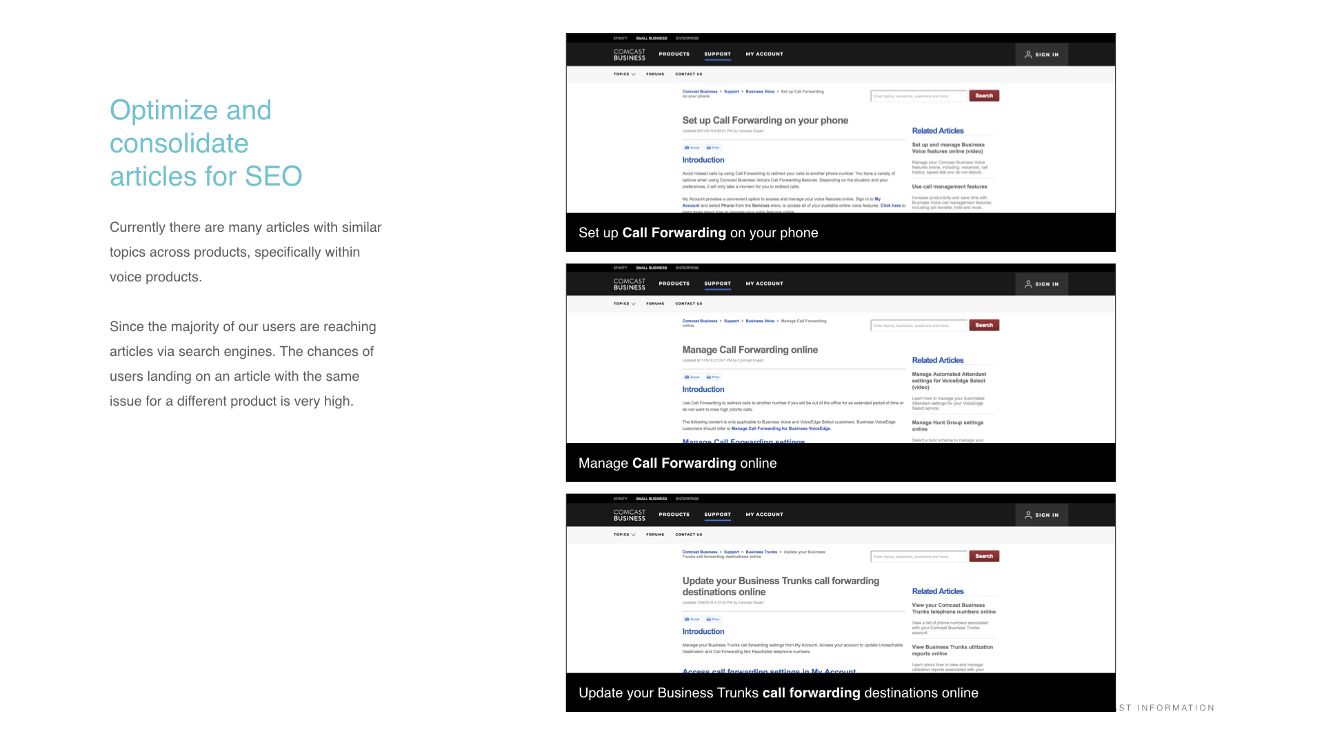
Throughout the tasks, participants frequently had trouble distinguishing between individual articles. Though they would navigate to the correct page and often the correct section, the article titles were often so similar that they weren’t sure which to select.
Participants responded very favorably when they saw the search results page. They appreciated the spacing between the search results, as it made them easier to digest, as well as the short blurbs that went with each result.
“There were ten or twelve or fifteen things, which is a lot, and they all started with the word ‘manage.’”
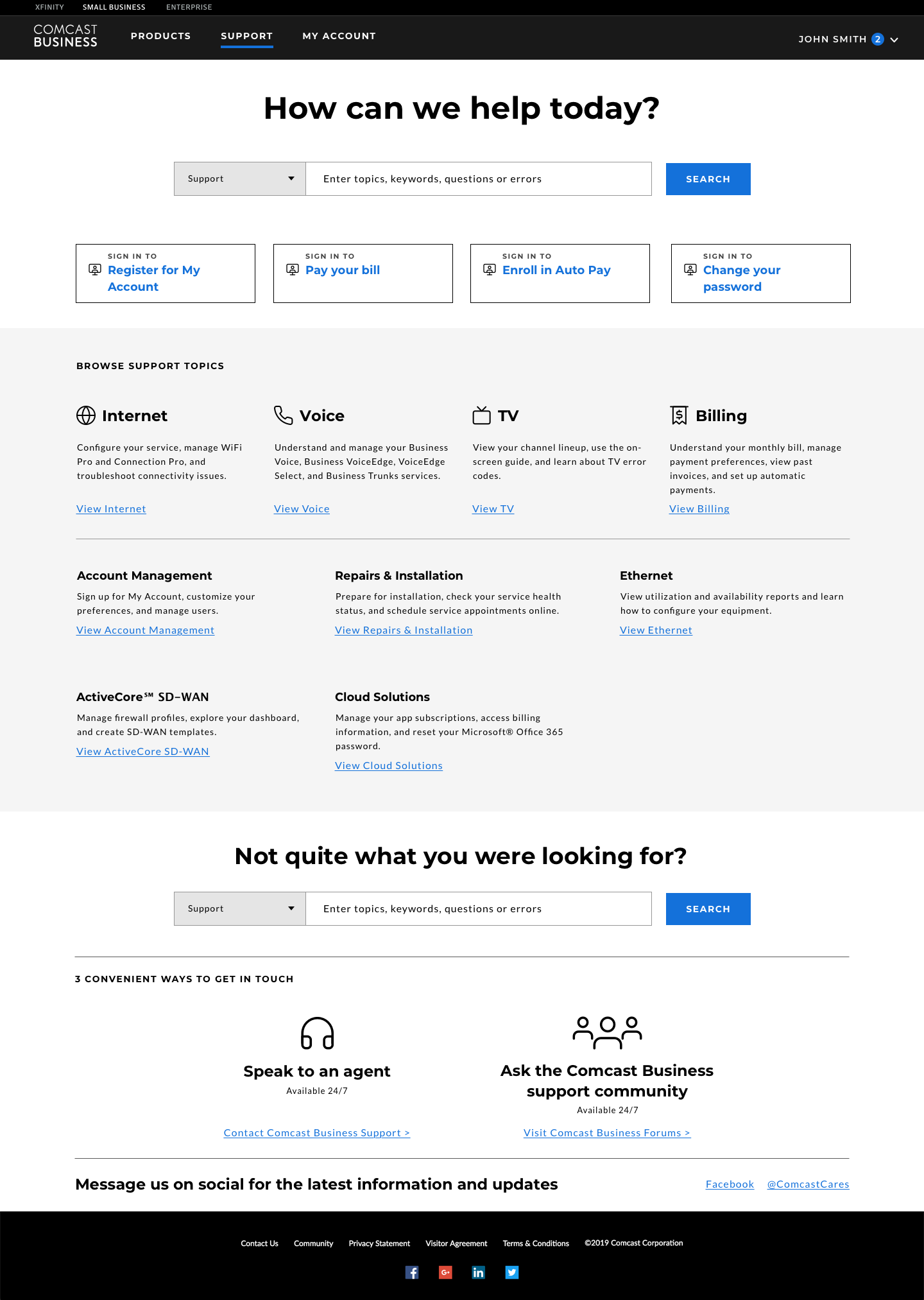
Visual Design

The modular approach to the design allowed for reusable components to be built and shared across the experience. Visual design principals were applied in accordance with the Comcast Business brand guidelines.
I continued to work with the Comcast Business development teams to ensure these designs were executed to the highest design standards. View the website here.